Tito’s TUners
Turbo. Torque. Thunder.
Specializing in going fast as f*ck. This racing brand is sure to bring the best quality performance, to your trusted torque machine. Speed in mind. This mock racing brand was an inspiration from my dog: Tito. 🐕
Little guy can go zero to 60 in 2.5 snacks. Talk about fast… ⚡

Planning
I love cars and I love dogs. Together, reimagined as a racing brand, is even cooler.
Tito was adopted by our family on October of 2021. He’s a great little guy with a sense of curiosity and lots of speed. There isn’t a time where this crazy dude wants to play, or just run around in circles. Quite the obvious choice for inspiration when creating this mock racing brand.
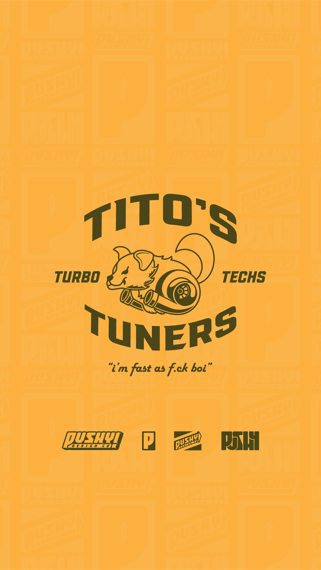
Using his name as the main source for the logos. I utilized other words that could potentially flow with Tito’s name.
Composition
Illustration is a strong suite of mine when creating logos. Most of my work involves a mascot or illustration of some sort. Drawing Tito wasn’t too hard of a feat. However, I did find some challenges when attempting to incorporate the twin turbos somehow.
Turbos generally have a circular shape with an extrusion at the end. I used this to my advantage and decided to add that in place of the legs. I then added a few minor touches and began vectorizing.
I wanted to keep the illustration fairly simple. This is to keep a clean aesthetic, whilst making the brand known for what it is.
Final Rendition
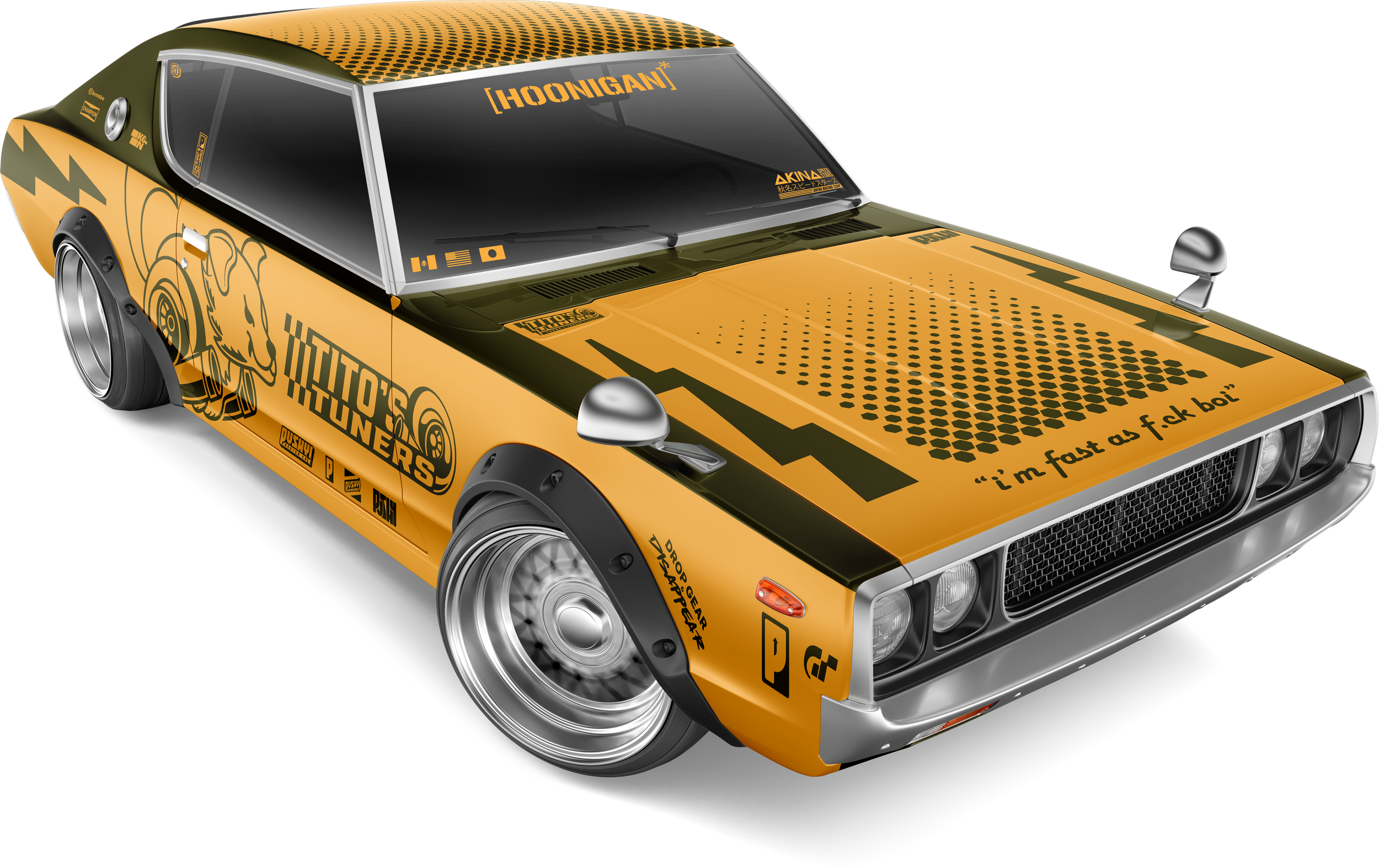
More than several logos were made for Tito’s Tuners. The logos were created in Illustrator. Photoshop was used for creating the mock up vehicle. I used layer masks to add most of the vinyl to the car. Some of the logos were manually placed and free transformed for better adjustment and alignment.
You can see some of the variants of the logos all throughout the vehicle. The main logo with Tito in the center could be used for big print applications or apparel. Meanwhile the other variations can be used for a more professional setting. Such as racing uniforms or physical goods.


