KNOCKOUT IPA
Strong, agile and elegant were the boxer gentlemen of the 1920’s. This mock IPA bottle showcases a design both bold and refined. Just like these gentlemen were in their heyday.
I wanted to showcase a dapper and lavish illustration with a splash of ruthlessness. That and with the use of Victorian style ornamentation, I was able to translate just that.
Try not to drink too many of these bad boys… they pack a punch.
(Pun intended)
Planning
Boxing and beer. A pairing that goes well on any occasion. This idea was pretty straight forward when it came to me. Create a label with a boxing influence. Something that packs a punch, but has class and composure
Old timey, 1920’s boxers somewhat gave me that vibe. They often were portrayed as classy, yet rugged gentlemen of great strength. A quick Google search gave me access to many boxers from that era.
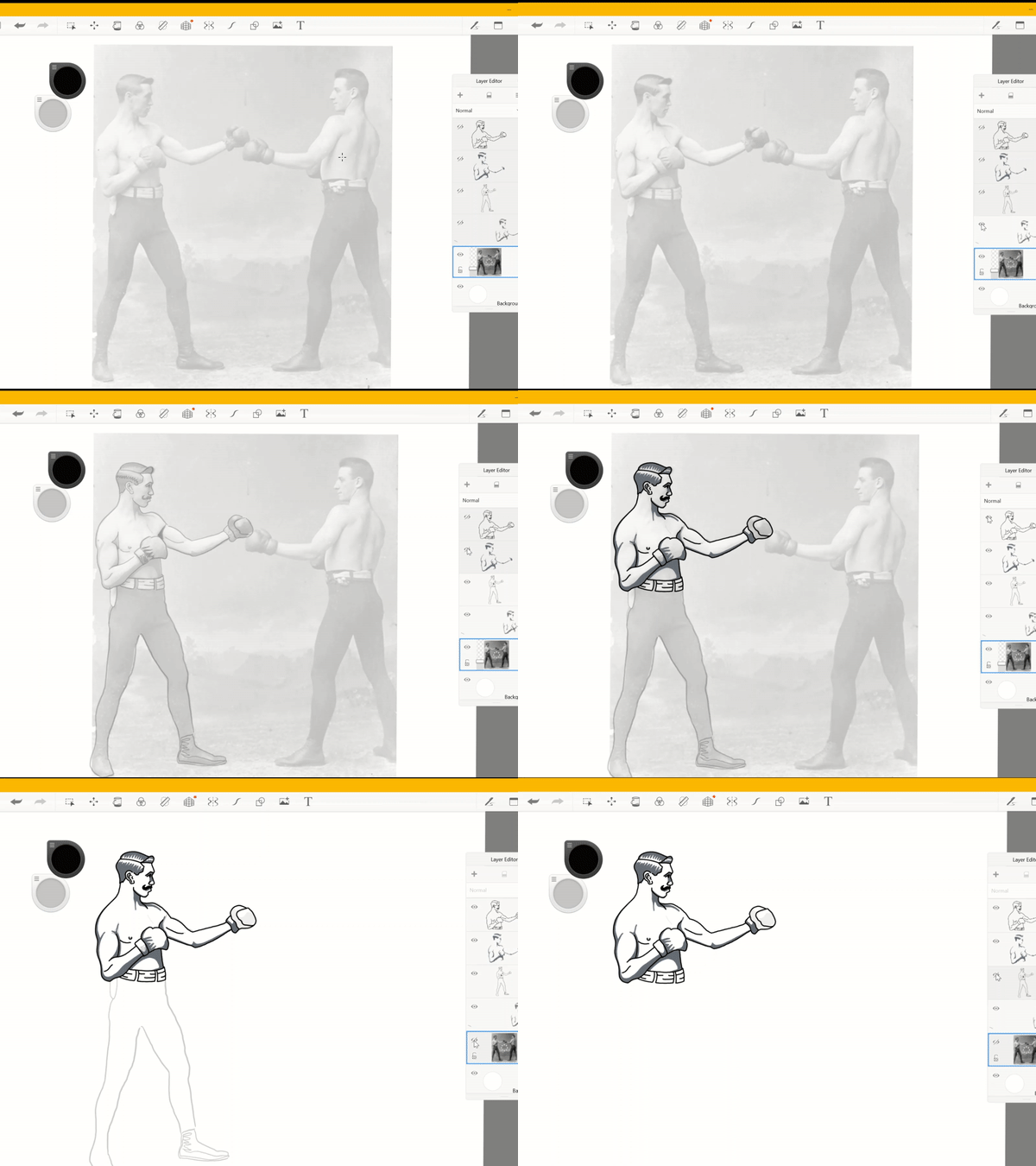
Once I found my image, I took to Autodesk Sketchbook to begin sketching and inking.
Composition
Once finished with sketching out the boxer, I took to Adobe Illustrator. A few vector packs of Victorian style ornaments seemed to do the trick for the initial composure of the logo.
I added a font and duplicated it a few times to add a drop shadow and give it depth. I then added tattoos to the boxer, as well as facial hair, to give him a more rugged look.
I chose the name Knockout IPA because, well… IPA’s are generally known for their alcohol potency. I felt the name fairly fitting for such type of beverage.
Final Rendition
After finishing with the artistic elements, I went ahead and put all the pieces together. I added a red trip around the entire logo to give it a bit more depth with the black label in the background.
The label and bottle were created in Adobe Photoshop. The entirety of the project was roughly 8-10 hours, composing of two days.
Autodesk Sketchbook, Adobe Illustrator and Adobe Photoshop were used for this project.


